




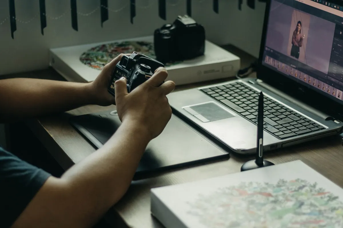

A portfolio is read in the time it takes to scroll. Visitors decide whether the work is worth their attention long before they reach the second project, and layout does most of that deciding. The work itself is usually fine; the frame around it is not. What follows is a diagnostic list rather than a manifesto. Open your own site in another tab, work down it, and note what you find — most of these problems take minutes to spot and an afternoon to fix.
1. Everything Shouts at the Same Volume
If your name, tagline, six navigation items, hero image and a strip of client logos all carry similar visual weight, the visitor has nowhere to land. Hierarchy is not decoration — it is instruction. On each screen, decide what you want seen first, second and third, then create visible gaps in size, weight or colour between those levels.
A concrete example: a project title at 34–40px with the client and year at 13–14px in a lighter grey reads instantly. The same two lines at 24px and 20px read as a muddle. The problem is rarely that things are too small; it is that the gaps between levels are too narrow.
The squint test
Step back from the screen, or blur your eyes. If you can still tell what matters most, the hierarchy is working. If the page turns into grey soup, widen the contrast between levels rather than shrinking everything to compensate.
2. Spacing That Drifts Instead of Repeating
Eighteen pixels here, twenty-six there, because each gap was nudged by eye until it looked about right. Individually, none of these choices is wrong. Together they make a page feel restless, and visitors register that restlessness even when they cannot name it.
Fix it with a scale: 4, 8, 12, 16, 24, 32, 48, 64. Pick values from that list and nothing else. When a gap feels wrong, move one step up or down the scale instead of inventing a number.
Pay particular attention to proximity. A section heading should sit closer to the content it introduces than to the block above it. If the space above a heading matches the space below, the page reads as a series of unrelated fragments rather than a structured argument.
3. Grids That Get Abandoned Halfway Down the Page
Text columns that shift left edge by ten pixels between projects. Thumbnails in four different aspect ratios. A caption that sits neatly under three images and floats beside the fourth. These small inconsistencies suggest a page assembled rather than designed.
Choose one grid, align to it, and crop your thumbnails to a consistent ratio — 3:2 or 4:3 usually work well for mixed work. Breaking the grid once, deliberately, reads as confidence. Breaking it on every project reads as accident.
4. Typography That Competes With the Work
Your portfolio type has one job: to disappear. Two typefaces is plenty, and one family used at different weights is often better. Beyond that, watch the basics that quietly wreck readability:
- Body text set in pale grey on white, which fails contrast and looks washed out on laptops in daylight
- Lines running the full width of a desktop screen instead of stopping at 60–75 characters
- Justified paragraphs that open rivers of white space down the page — left-align instead
- Whole paragraphs in capitals, which slow reading considerably
- Centred body copy that runs beyond two or three lines
A body size of 16–18px with line height around 1.5 handles most portfolio copy comfortably. If in doubt, make the text slightly larger and the colour slightly darker than feels necessary.
5. Mobile Treated as an Afterthought
Plenty of your visitors arrive on a phone, often between other things, and they will judge the site on that experience rather than the one you admired on a wide monitor. The usual casualties are predictable: a hero image cropped so the subject sits off-screen, captions that only appear on hover, tap targets smaller than a fingertip, and project titles in a display face that wraps onto four lines.
Resize your browser to 360px wide and use the site properly — click, scroll, go back. Then check it on an actual phone, outdoors if you can. If an interaction depends on hovering, give it a tap or focus equivalent. If a button needs careful aiming, it is too small.
6. Navigation and Contact Buried Out of Sight
If someone has to hunt for how to return to the work, or how to email you, they will simply leave. Three things should be visible on every project page: a way back to the index, your contact details in the header or footer, and a link to the next project at the bottom.
Write your email address as text rather than hiding it behind an icon; icons are ambiguous and easy to miss. And keep the small frictions in check — no scroll-jacking, no custom cursor that hides the pointer, no lightbox without a close control within easy reach.
A Ten-Minute Audit You Can Run Today
You do not need a redesign to make real improvements. Run this sequence on your live site and make a note of everything that fails:
- Squint at your homepage and write down the first three things you see, in order. Compare that with the order you intended.
- Measure your vertical gaps. If you find more than four distinct values, consolidate them onto a scale.
- Shrink the window to 360px and complete one full journey, from landing to sending an enquiry.
- Tab through the site with the keyboard only. Every interactive element should be reachable and visibly focused.
- Read one project page as a stranger would, aloud. Note where you get bored or lost.
Pick the three most damaging findings and fix those this week. A portfolio that is live and ninety per cent right will always beat one that is flawless and still unpublished — and the remaining ten per cent is much easier to judge once real visitors are using it.
Photo: Pavel Danilyuk / Pexels